Benjamin Moore Paint Experts Serving RI
Choosing paint is not just about color. It is about making sure your home looks right, lasts longer, and feels like yours.
At The Paint Shoppes, you do not have to guess. Our experienced team helps you choose the right paint, the right finish, and the right color so your project turns out exactly as planned.
Built for Contractors. Backed by Experts.
Get the products, speed, and support you need to keep every job on track. From premium Benjamin Moore coatings to our dedicated PRO team, The Paint Shoppes Contractor Center is designed to help professionals work more efficiently, deliver consistent results, and stay ahead on every project.

Premium Paints & Expert Services in RI
From high-quality Benjamin Moore paints to personalized color consultations and contractor support, The Paint Shoppes has everything you need to bring your project to life. Whether you're updating a single room or managing a large-scale job, our team delivers the products, expertise, and service to help you achieve professional results with confidence.


Why Customers Choose The Paint Shoppe
You deserve more than a shelf of paint cans. You deserve guidance from people who know paint inside and out.
For over 65 years, homeowners and contractors across Rhode Island have relied on The Paint Shoppes for:
- Clear answers, not sales pressure
- Expert color coordination and product recommendations
- Consistent quality across every location
- Help before, during, and after your project
Our average employee has been with us for more than two decades. That experience shows in every recommendation we make.
The Paint Shoppe Locations
With five convenient Rhode Island locations, The Paint Shoppes make it easy to get expert advice, premium Benjamin Moore products, and the support you need—right near you.
Your Trusted Guide for Benjamin Moore Paint
Benjamin Moore is known for exceptional quality, durability, and color depth. We help you get the most out of it.
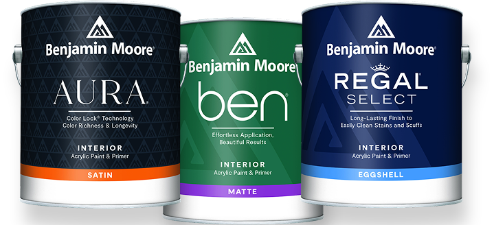
With premium lines like Aura, you get:
- Rich, long-lasting color that stays true
- Excellent coverage that saves time & effort
- Low odor and low VOC formulas for healthier spaces
- Smooth finishes that look professional
We guide you through product selection so you use the right paint for bathrooms, bedrooms, exteriors, and high-traffic areas.

Color Selection Made Simple
Color choices can feel overwhelming. Our goal is to make them feel confident.
We help you:
- Narrow down colors that work with your lighting and space
- Match existing finishes or fabrics
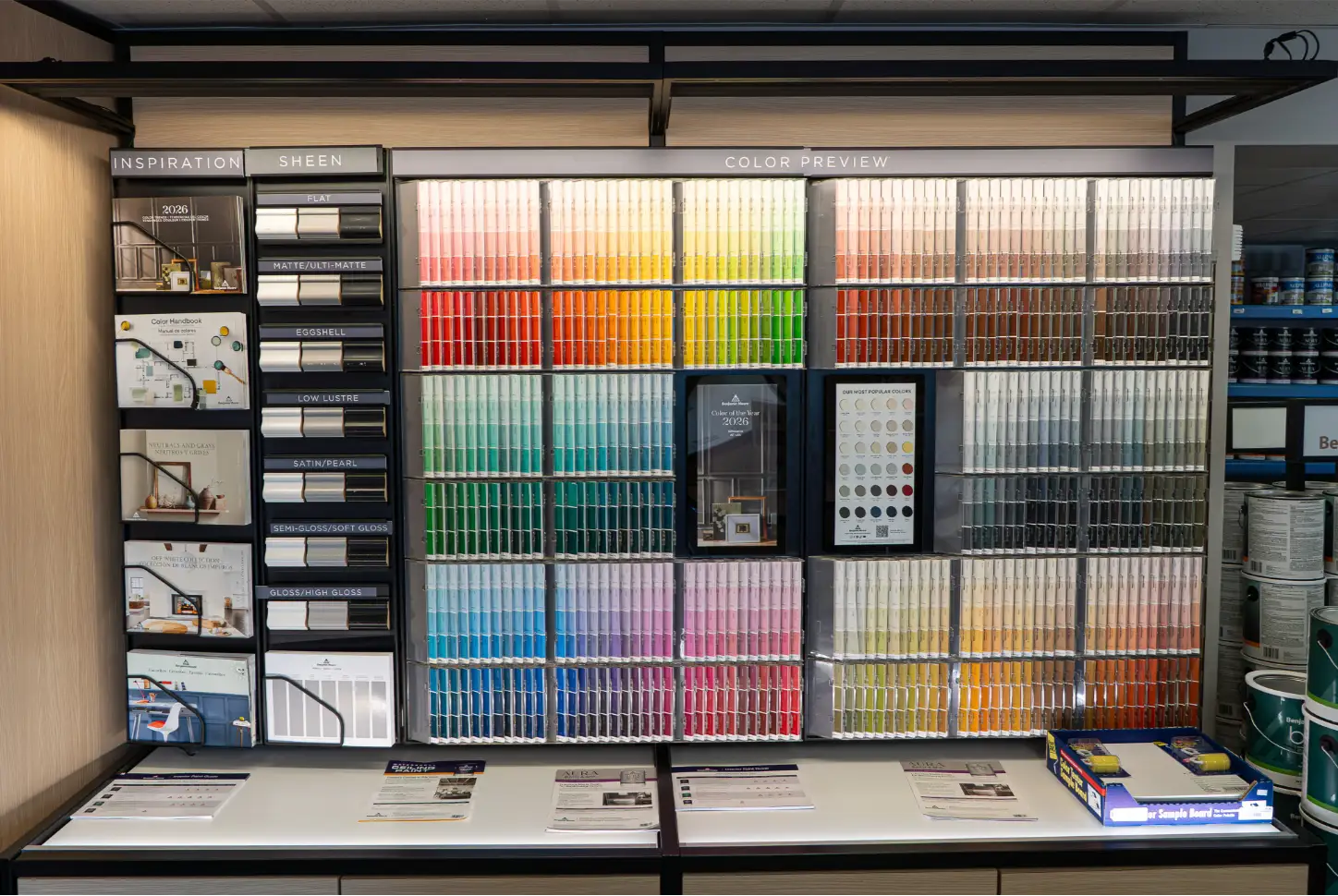
- Choose complementary palettes using Benjamin Moore color tools
- Avoid costly mistakes before you paint
With in-store color tools and one-on-one advice, you can move forward knowing your choice is the right one.
About The Paint Shoppes
For over 65 years, homeowners and contractors across Rhode Island have trusted The Paint Shoppes for expert guidance, premium Benjamin Moore products, and service that makes the process easier from start to finish. As a family-owned and operated business now entering its third generation, we understand that quality, consistency, and trust matter.
What truly sets us apart is our people. Our team is made up of experienced professionals, with the average employee having more than 20 years with our company. That depth of knowledge means you get real advice, not guesswork. Whether you need help choosing the right product, matching a color, or planning a larger project, we take the time to listen and guide you toward the best solution.

Built for Homeowners & Contractors
Whether you are refreshing one room or managing multiple job sites, we make your work easier. Homeowners get personalized support and trusted advice.
Contractors get fast service, job site delivery, and product expertise from our PRO TEAM. Our fully staffed stores are designed to save you time while delivering professional results.

Serving Rhode Island With Five Convenient Locations
With paint stores in Providence, East Providence, Warwick, West Warwick, and Johnston, expert help is always close by.
Visit any location to speak with a knowledgeable consultant and get the support you need for your next project.


